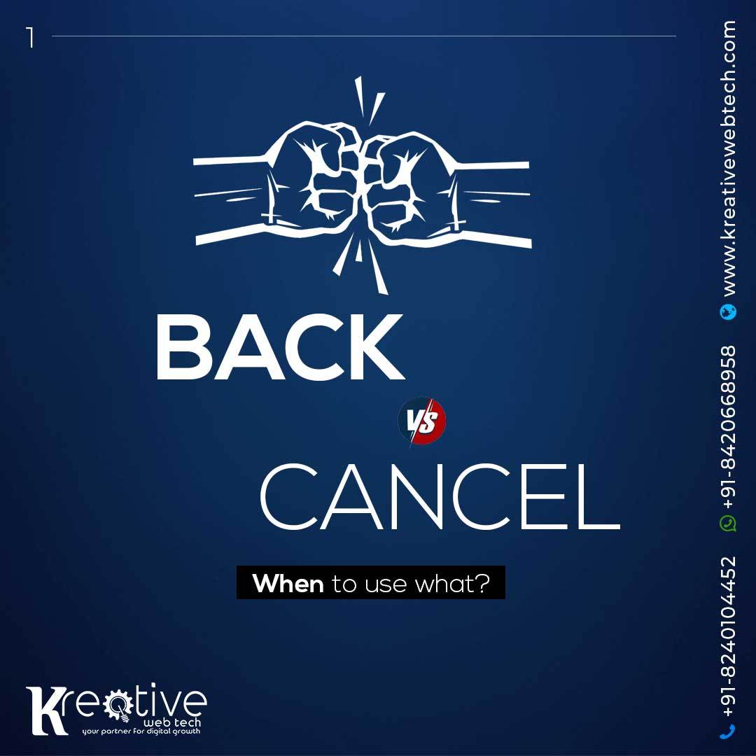
Back Vs Cancel
Usually, there are 2 ways to exit the screen
- ‘X’ icon or ‘Cancel’
- Back arrow
Now when to choose what?
Let’s see some examples from the real apps.
Instagram Stories:
- ‘X’ makes sense because the back arrow would confuse users to go to previous story,
- and not to actually exit the stories.
- Also, the stories are a part of the seperate flow from the other screens.
Photo editing:
- Because we are changing the settings of the photo, it needs to be clear for the user that
- the follow will be cancelled and the inputs will (most likely) be lost. The back
- arrow would give a wrong impression.
booking.com ptoperty:
It doesn’t contain the inputs fields, nor it’s the seperate flow in the journey,
therefore we can easily place an arrow to go back.
But it doesn’t have to be like this. For example, Airbnb uses ‘X’ in their property details screen.
A few takeaways:
Use the ‘X’ icon or ‘Cancel’
- To avoid losing data the user puts in
- To close the 1. step in the new flow
- To close the model view
You can use the back arrow when:
- The user doesn’t input anything
- It’s a part of the new flow, but it doesn’t exit the flow. It simply goes
back to the previous step.
How do you use the back arrow and ‘Cancel’ / ‘X’?