Expected Web design Trend That Will Happen In 2017
With the rapid development of the online world, it becomes highly necessary to stay updated on the latest trends of web designing. The past few years have experienced abundance of latest ideas and technologies and with all the major web browsers supporting both the CSS3 and HTML5 standards and the superfast JavaScript engines strongly, the web designers never had so many options at the creative disposal. Now this is the high time to think about the changes that are going to take place in the next year. Therefore, in this article, you will find a compiled list of upcoming trends in web design service in the year 2017.
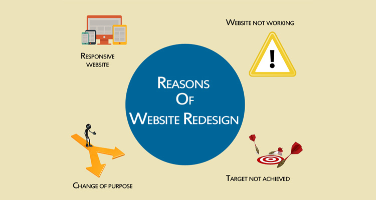
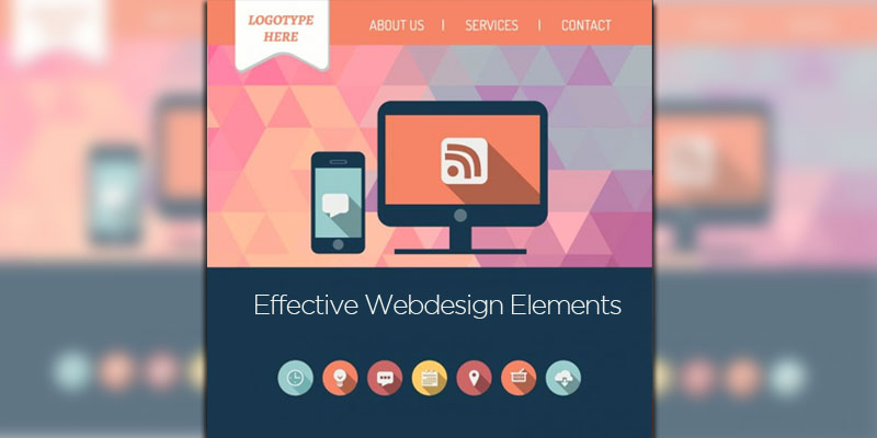
1. Responsive web design:
The trend of responsive web design has been for years now. But in the year 2017, it is expected to see age responsive design, where the content would adapt to some particular users on the basis of their proficiency and age. Besides, here the font sizes, navigation menus and color schemes would adjust as per the competency of the users.
Read More: Responsive webdesign makes your website more mobile friendly
2. Widespread use of rapid prototyping tools:
Though this is not a conventional design trend, but rapid prototyping tools are considered as one of the most important breakthroughs to hit the world of web designing over the last year or so and now it has almost become a must have tool for any UX, UI and web designer. These tools allow the designers to create working high and low fidelity prototypes of sites and services quickly to gauge the aesthetic and usability, without the requirement of writing a single line code.
3. UI pattern and frameworks:
The mobile first and responsive approach in the field of web design and the popularity of WordPress has a vital impact on how the desktop sites will look like at the present time and how these actually work. Here one can see an enhanced use of UI and UX patterns coming up across the web with different sites working and looking similar. In fact, the present UI and UX patterns would evolve and further develop such that more and more companies will implement this strategy and move closer to offer a consistent experience to the users.
4. Message:
The website home page must have a concise and clear message, which should inform about the company and what the company can do. This is the first thing that a visitor notices on a site. So, it is important to capture the attention of clients instantly with meaningful messages.
5. Video:
At the recent time, videos have become highly popular for the sites, mainly because of the increase in the Internet speed as well as due to the wider accessibility for the users. A large number of people now prefer to watch videos to learn something than reading contents. According to the experts, these days, around 86% of the online marketers and 96% of the B2B companies use video in the marketing campaigns.
6. Originality:
2017 will mark up the end of using stock photos on the sites. It is because; cheesy stock imageries only project unauthentic vibes, which can be negative for a business website. So, this is the time when you should get out the camera and take out your own photographs or hire a professional to click photos for your site. Besides, be relatable and original by integrating some bold typography, fun illustrations, authentic looking photography and animations.
7. CMS:
CMS system like WordPress is going to become more customizable, advanced and popular. As a result, it becomes easier to add or edit contents and also to keep the website updated all the time.
8. Advanced animation:
In 2016, there was a rise in the animation in web design, and this trend will surely grow in 2017. Slowly Animation is becoming the expected future, instead of being an added extra. Therefore, this is one element of web design, which needs to be considered after drafting the concept. So, animation is a lot more than creating attention, it can also be used as one directive tool to show the users the things that they are expected to do next. This works as a wonderful method of making user experience more enjoyable.
9. Mobile first approach:
As the statement suggests, the mobile first designs are mainly procedures, which ensure that the sites are mainly designed for the mobile devices and therefore for the big screen of computers. The mobile first design doesn’t work as a new concept; in fact this has been around for a few years. But it is expected that in 2017, this web design trend will be accepted by more and more brands as the number of people using mobile devices is increasing in leaps and bounds. This is why, it becomes a challenge for the web designers to design content for small screens.
10. Advanced scrolling mechanisms:
In 2017, scrolling will go far beyond just a simple technique for getting to the bottom of webpage from the top. Infinity scrolling has really become popular from 2016, therefore this trend of web design will not go anywhere soon. This scrolling mechanism will be highly appreciated by the Smartphone users. For instance, Facebook is now using advanced scrolling mechanism increasingly. Here by scrolling through the contents, the users will be able to see particular areas of the website become alive while they reach to a specific content block. Here scrolling doesn’t just work with static contents and the videos start playing as the users reach to them. Besides, as early as the users navigate to any other content block, the videos pause for additional reference.